
Player Modal, Reimagined
The player details modal got the editorial treatment — less scrolling, more answers, and a layout that actually respects your time.
The Full Story
The old player details modal was the informational equivalent of a junk drawer. Six sections, equal visual weight, the data you actually cared about — weekly results — buried below height, weight, and birthdate like some kind of NFL combine scouting report from 2004. Want to know if a free agent is worth picking up? That'll be four scrolls and a squint, please.
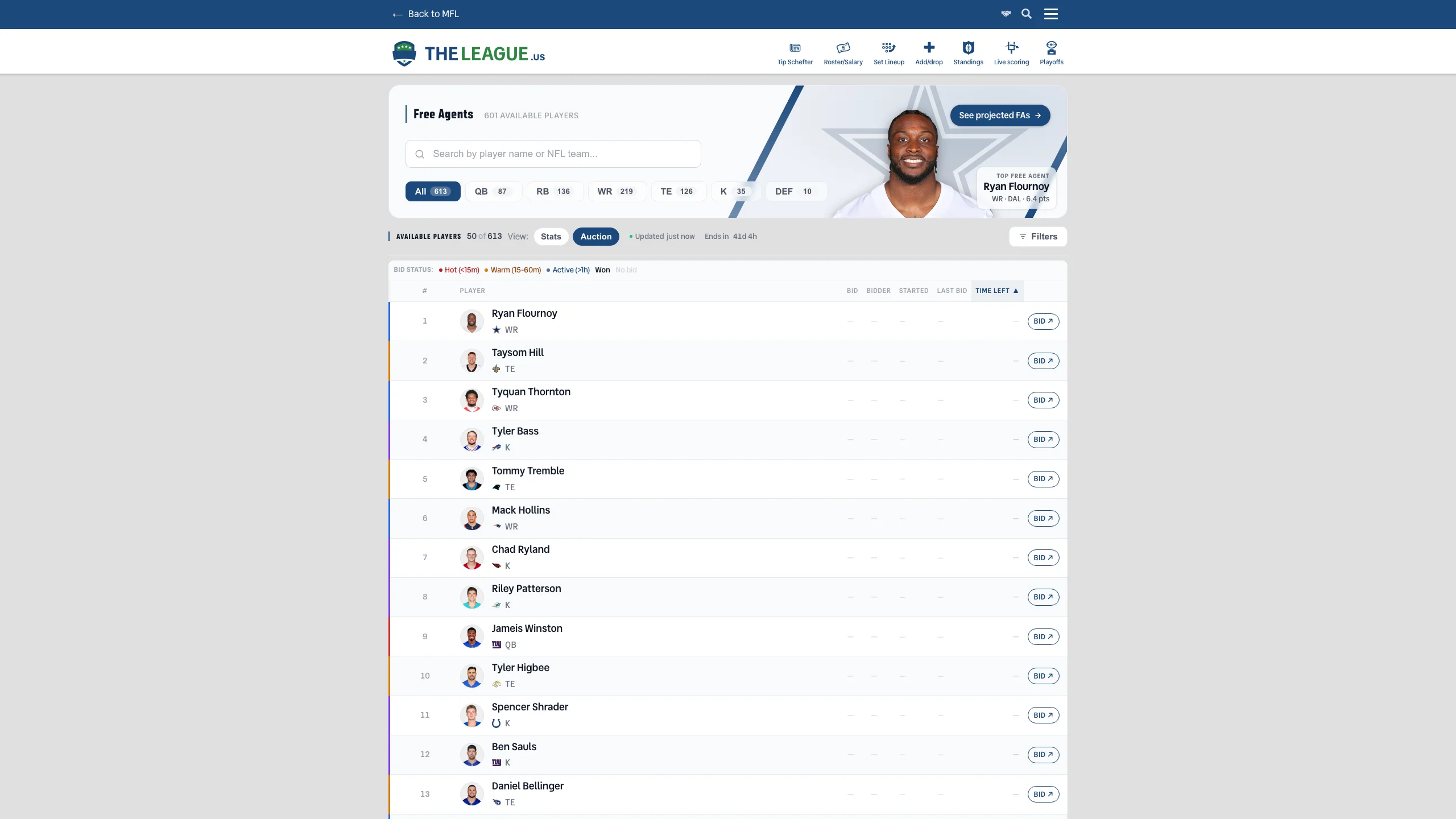
The redesigned modal flips the hierarchy entirely. At the top: a clean hero section with the player's headshot, name, team, and age — everything you need to confirm you clicked the right guy. Below that, three metric cards give you the instant 'worth it' signal: total fantasy points, points per game, and contract status. Then the weekly results table — promoted from the basement to prime real estate — with color-coded matchup difficulty, compact rows for unplayed weeks, and your fantasy manager's face in the status column. Supporting details like height, weight, draft pedigree, and contract breakdown are still there, just tucked into a compact section at the bottom where they belong.
The whole thing works on mobile too — slides up as a bottom sheet, hides the less-useful columns, and keeps the information you actually open a modal to see front and center. Click any player name on the Free Agents page and see for yourself. Or don't, and keep scrolling past someone's college to find out if they scored points last week.
Message